


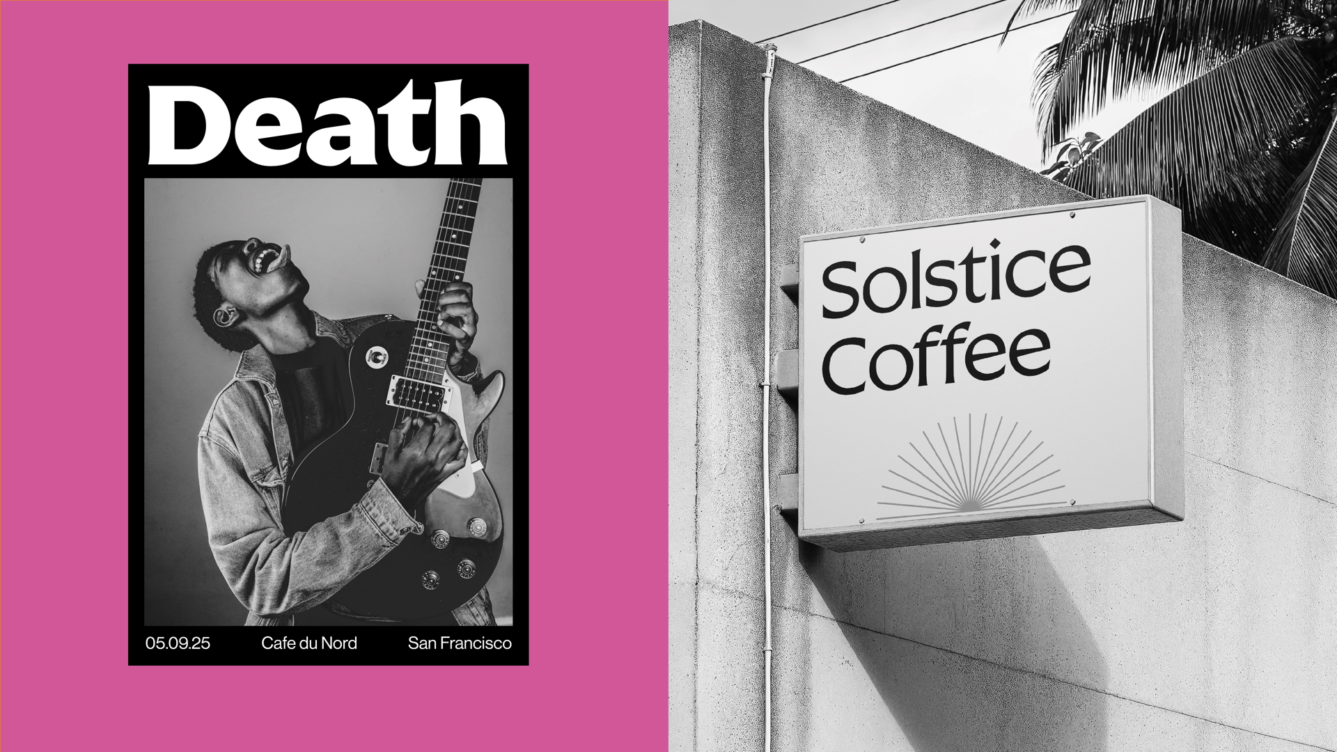
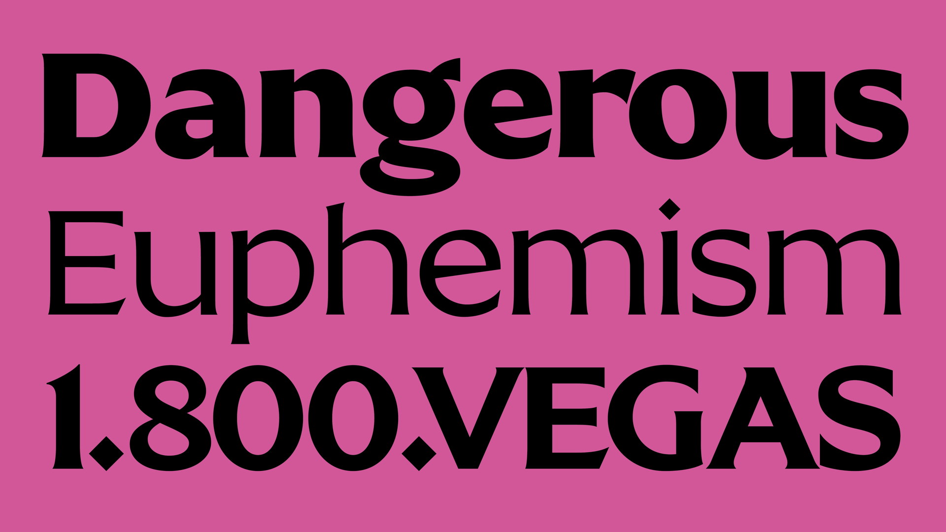
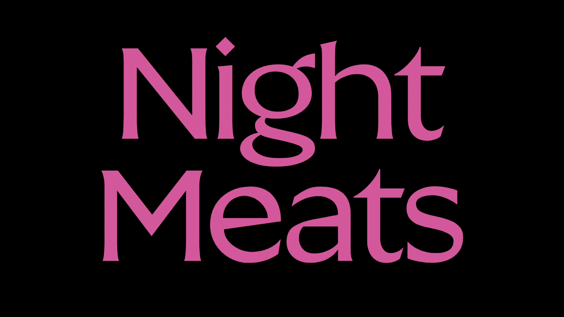
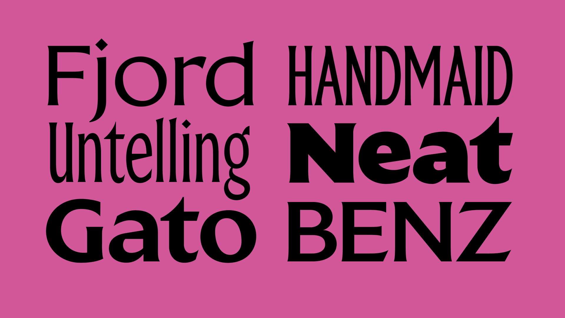
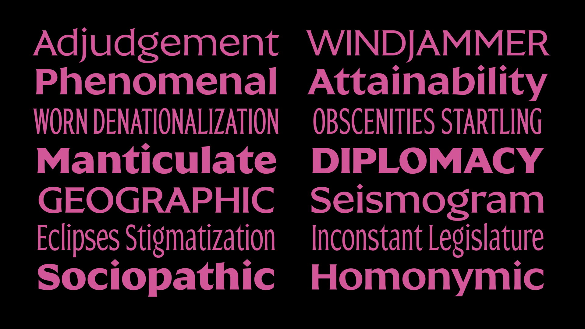
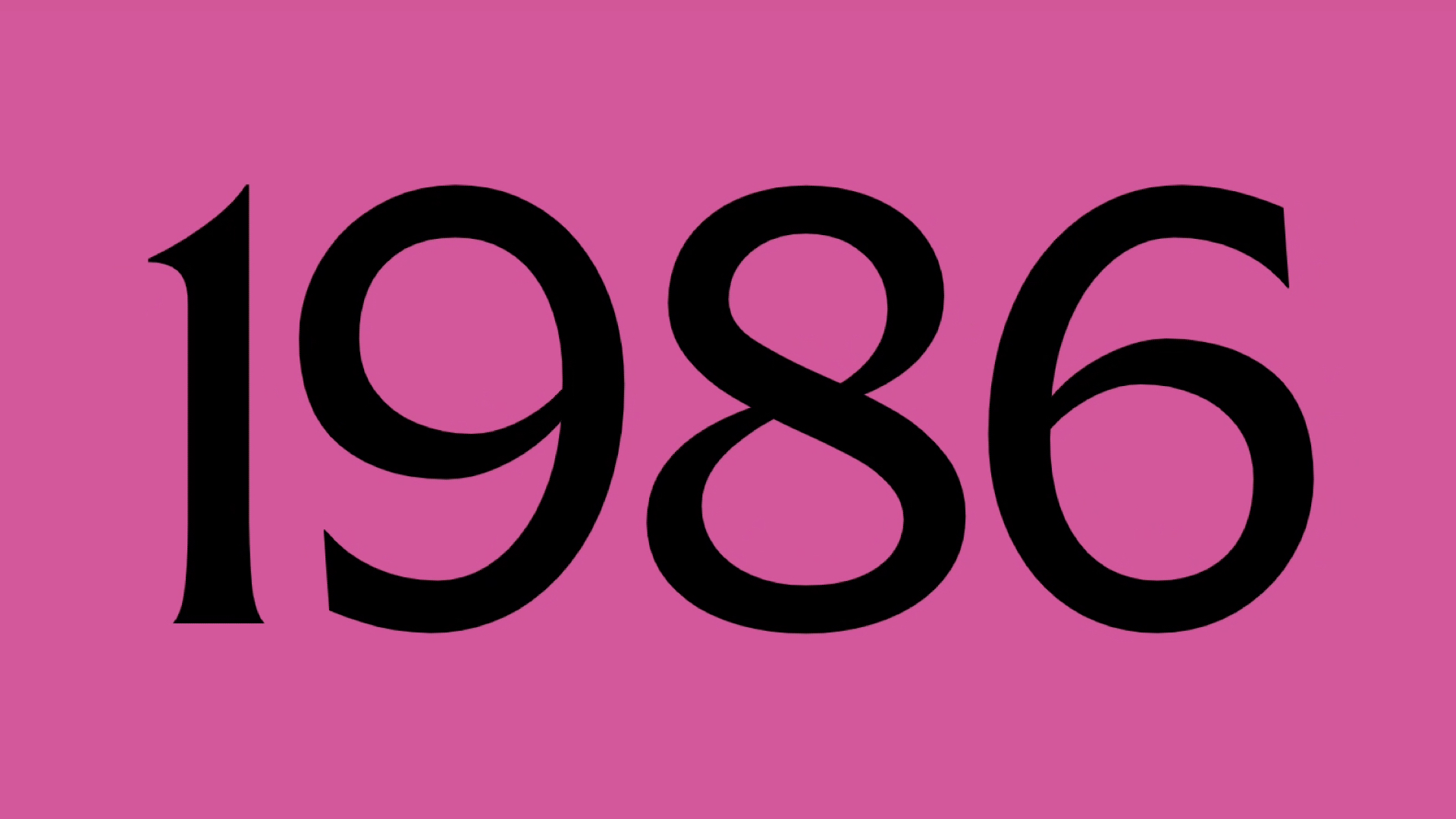
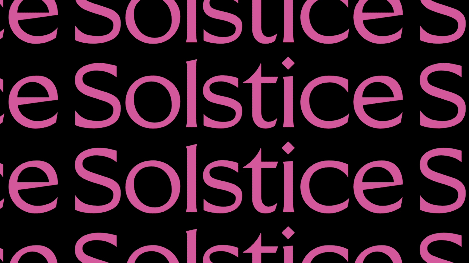
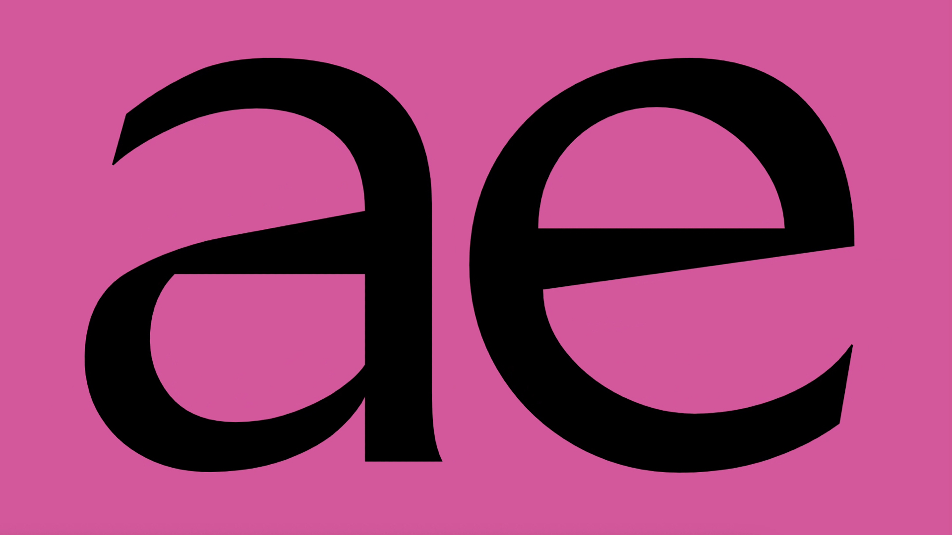
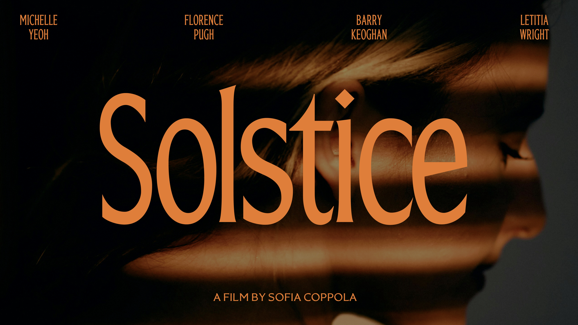
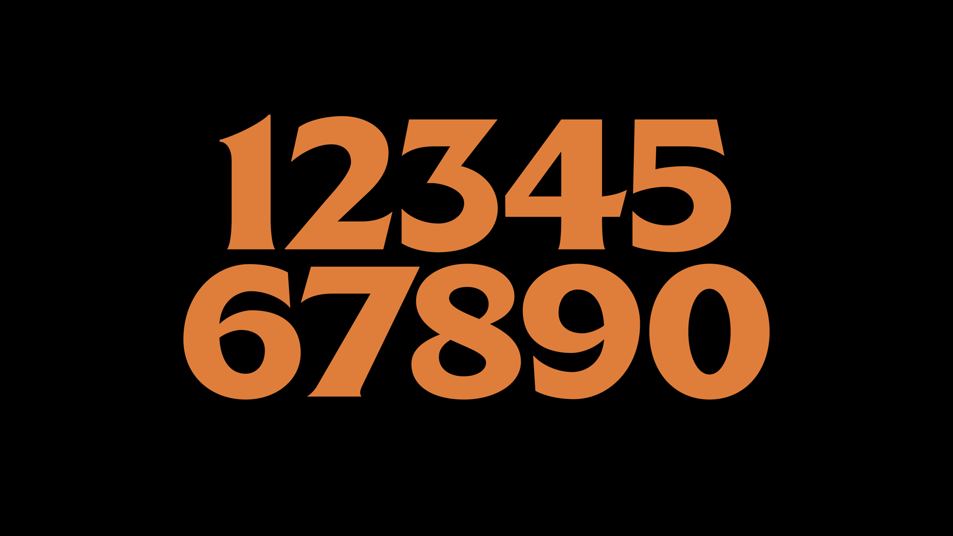
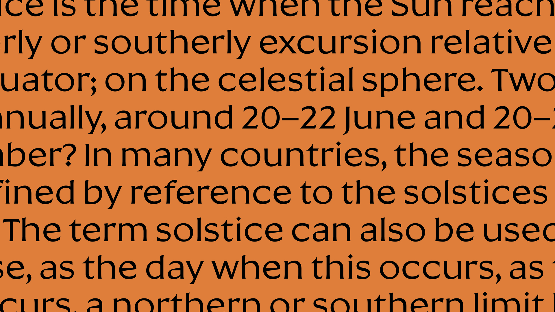
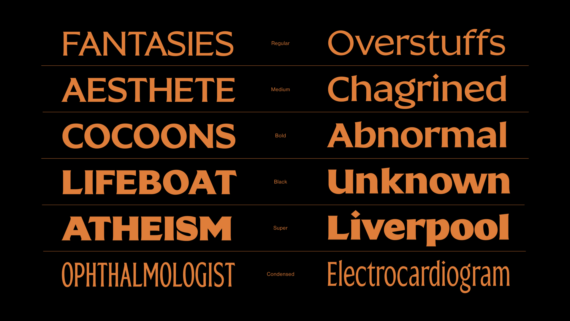

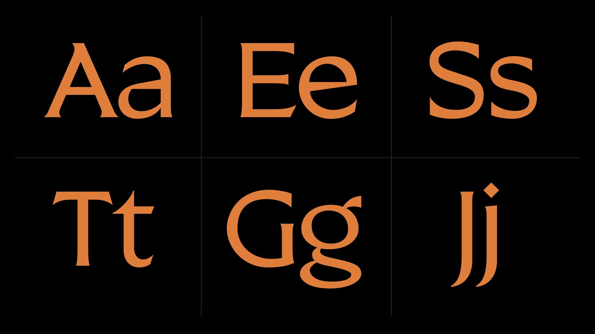
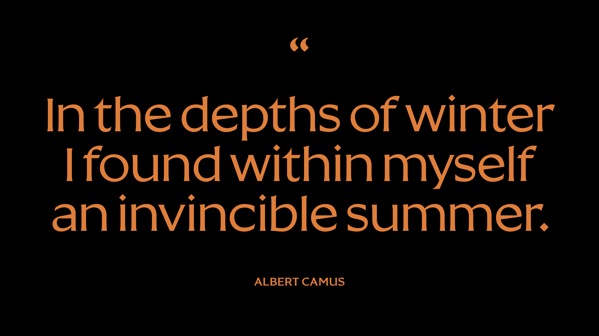
SOLSTICE ORIGINAL TYPEFACE
Solstice is a classically inspired typeface with a modern aesthetic. Inspired by stone-carved letterforms and calligraphic strokes, its six styles offer a range of possible applications from branding and packaging, to editorial and film titles. Solstice is first and foremost a display face, but its flexibility enables legibility at smaller sizes.
Solstice is a classically inspired typeface with a modern aesthetic. Inspired by stone-carved letterforms and calligraphic strokes, its six styles offer a range of possible applications from branding and packaging, to editorial and film titles. Solstice is first and foremost a display face, but its flexibility enables legibility at smaller sizes.
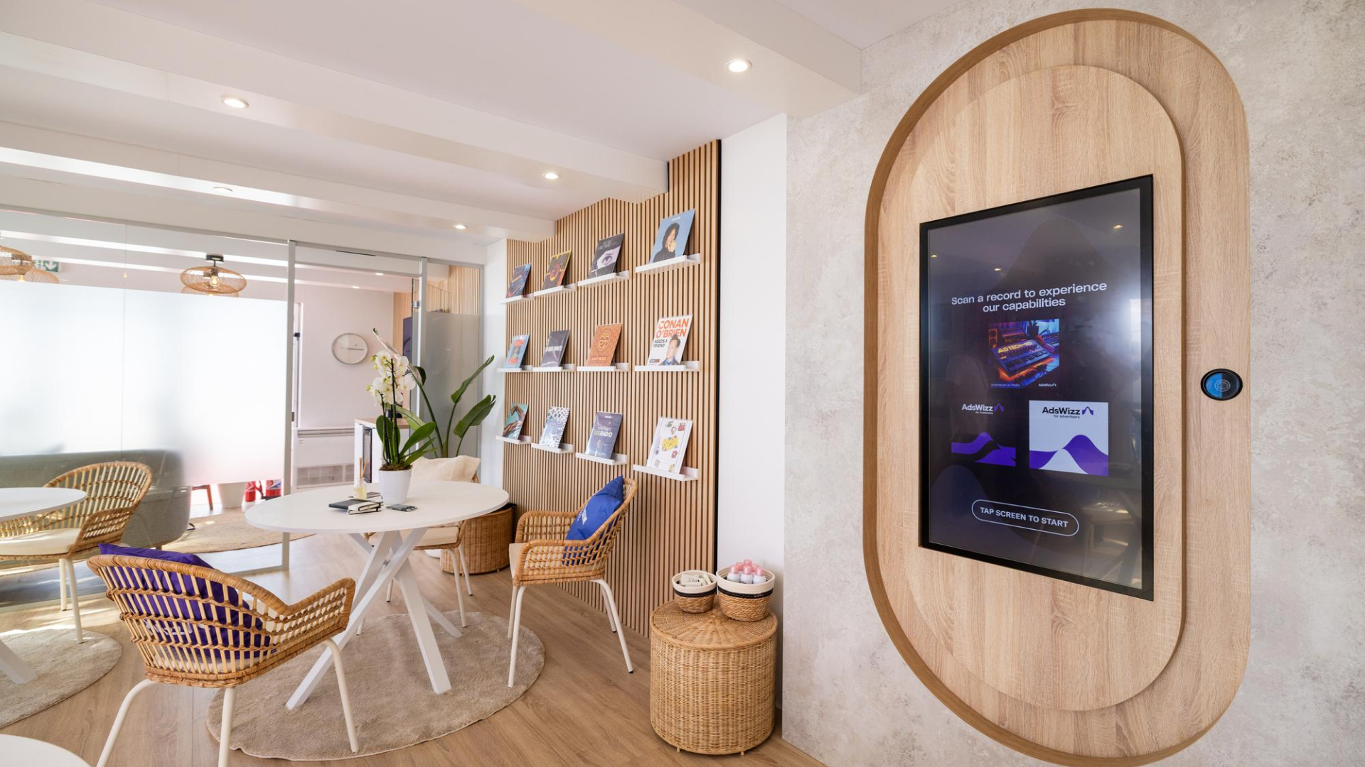
POP-UP RECORD SHOP AT CANNES LIONS
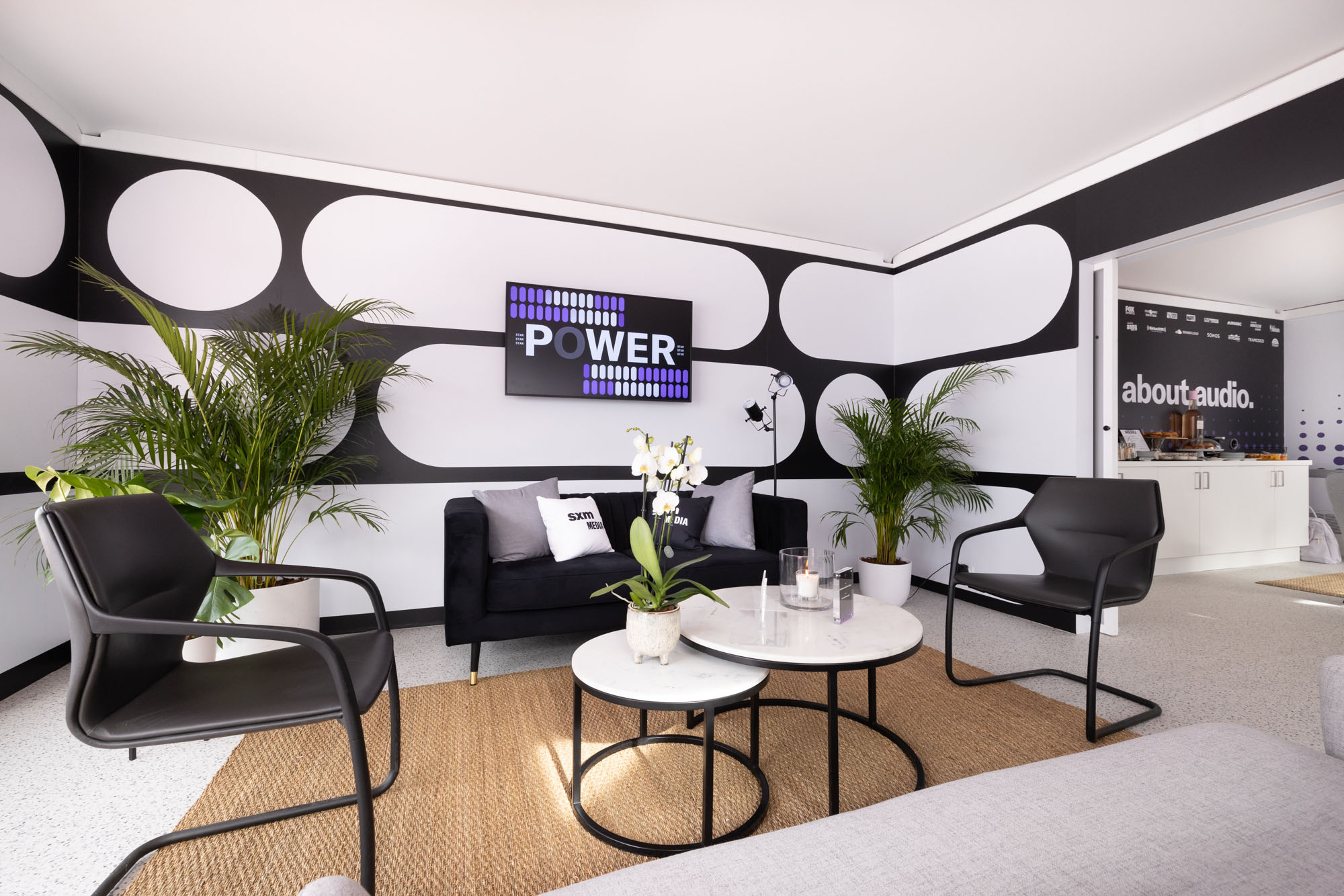
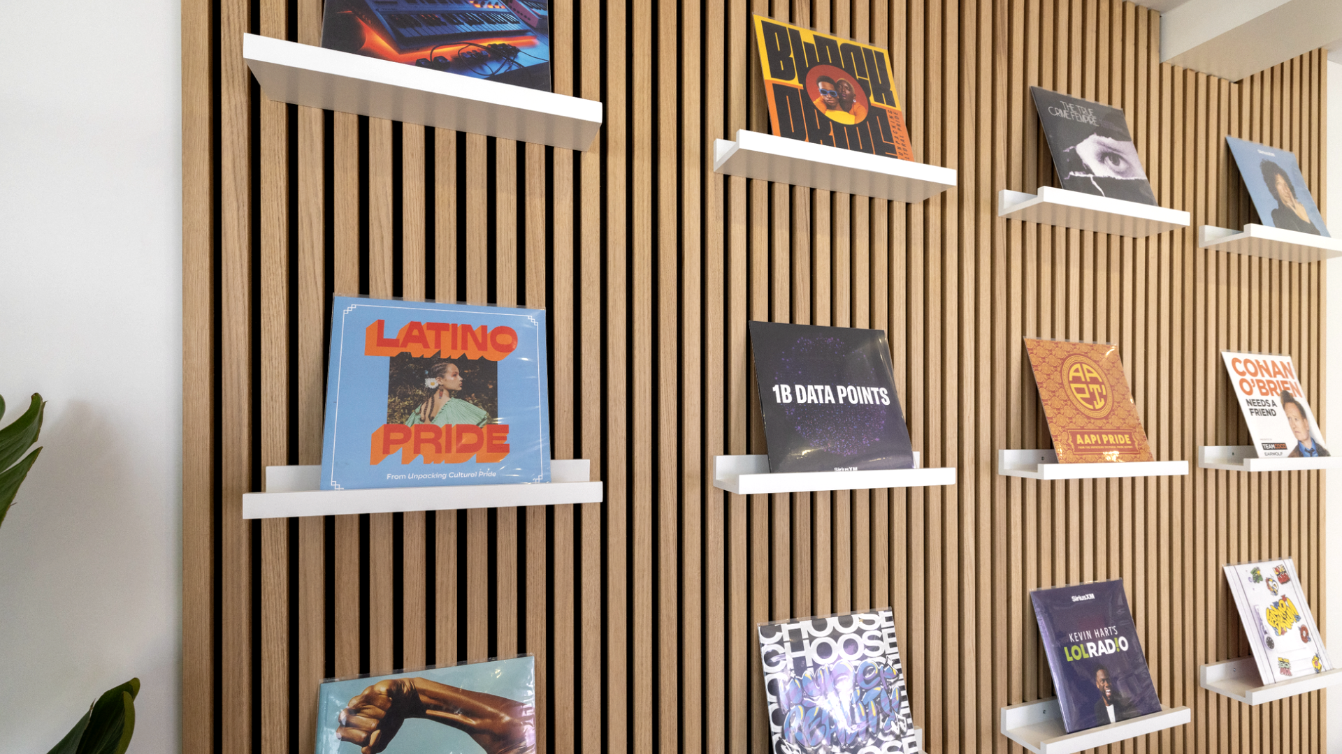
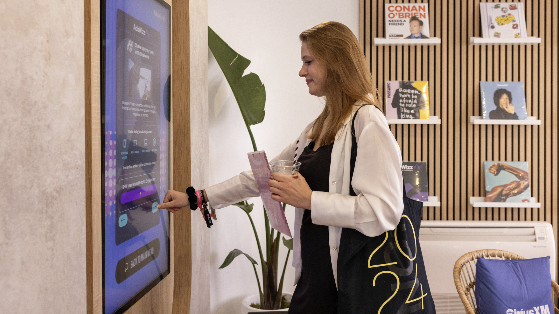
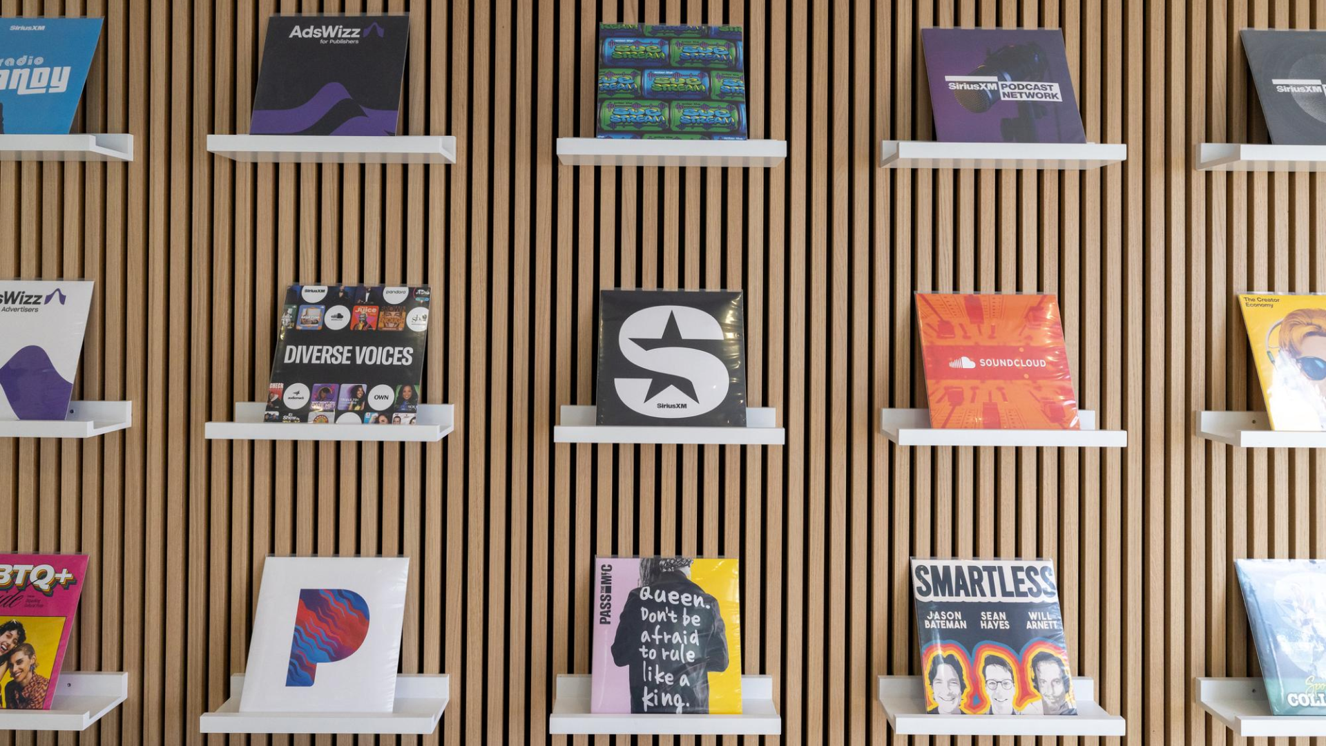
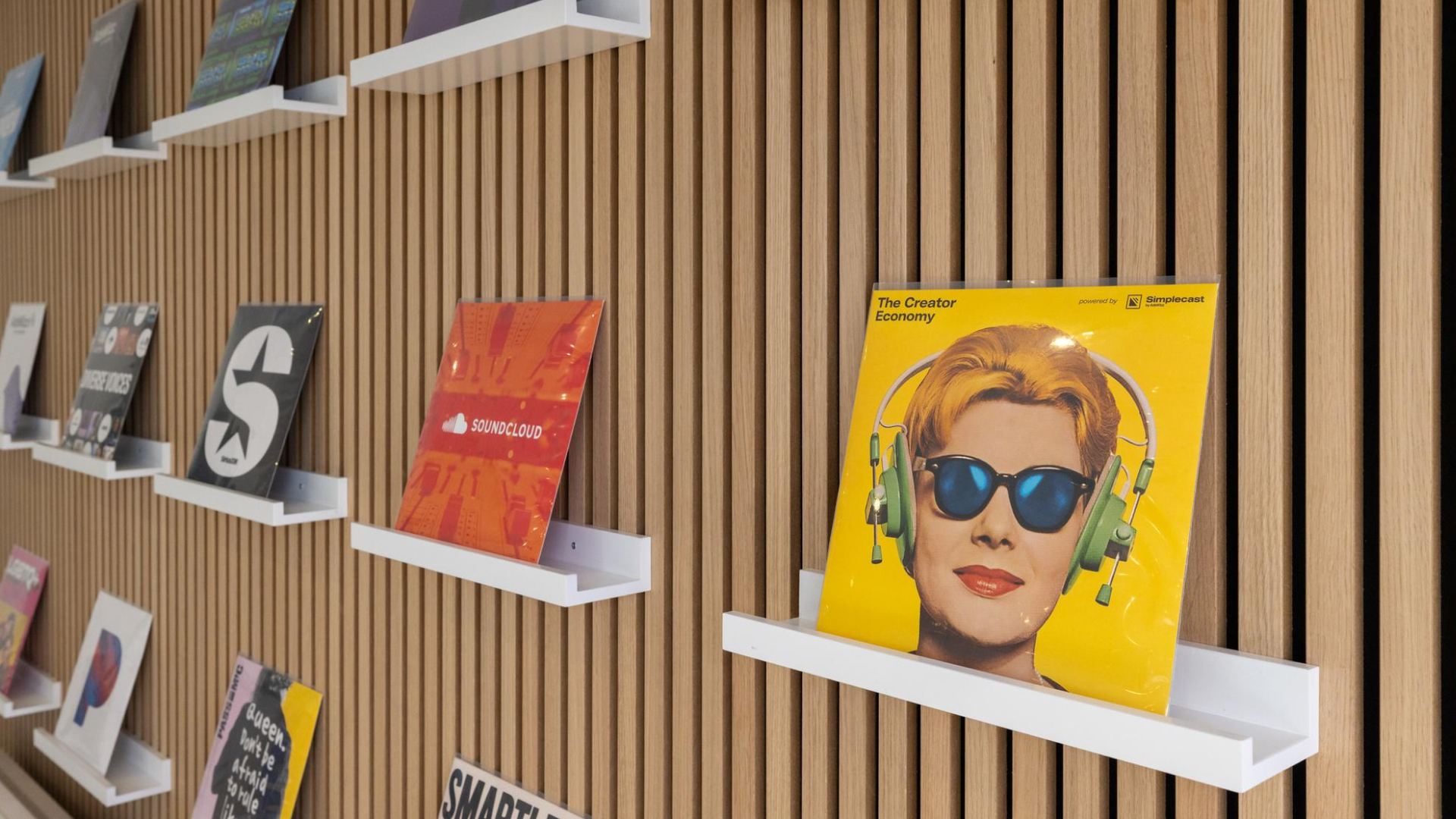
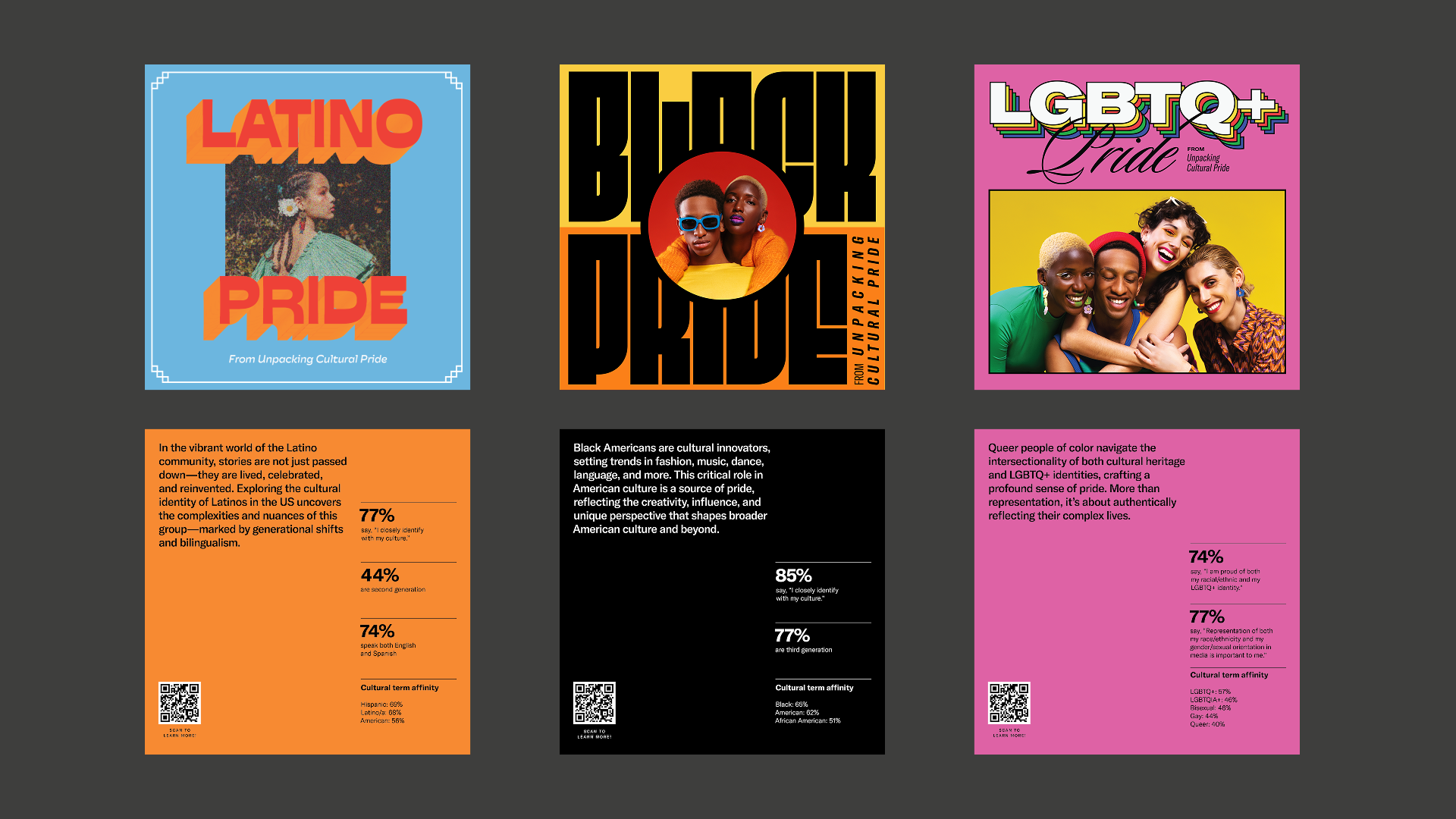
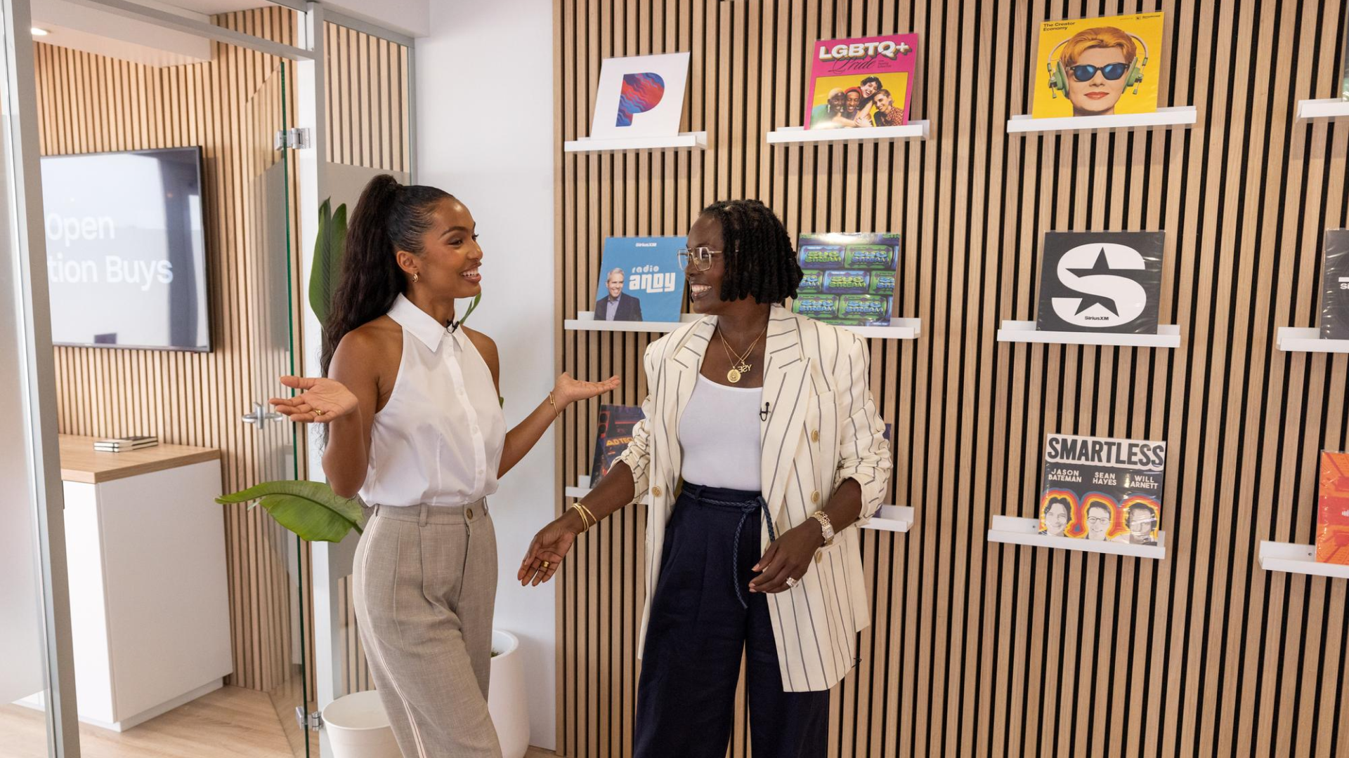
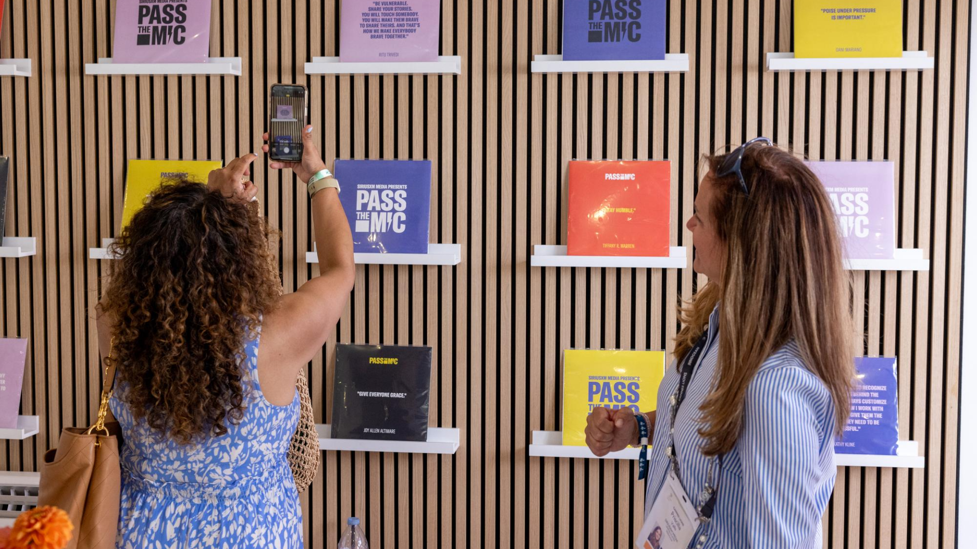
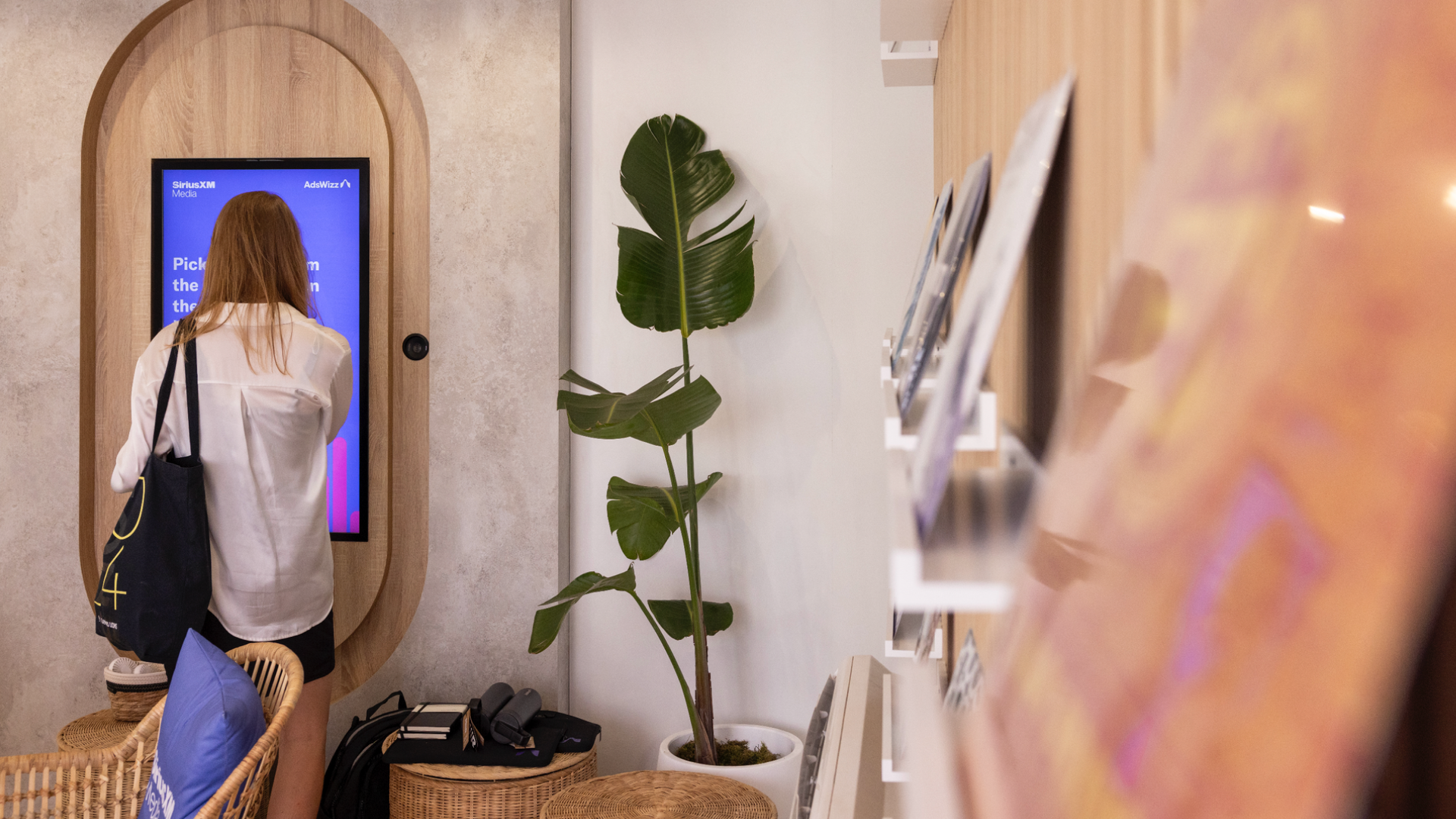
To create a more engaging and informative experience for SiriusXM’s advertising clients at Cannes, we created a record wall installation complete with a “listening station” where clients can listen and learn about our audiences, podcasts, channels, and platforms.
Lead Designer: Whitney Smith
Designers: Brian Yuen, Joanne Easton, Brooke Lewandowski
Creative Director: Jeff Zemetis
Production Partner: 2LK
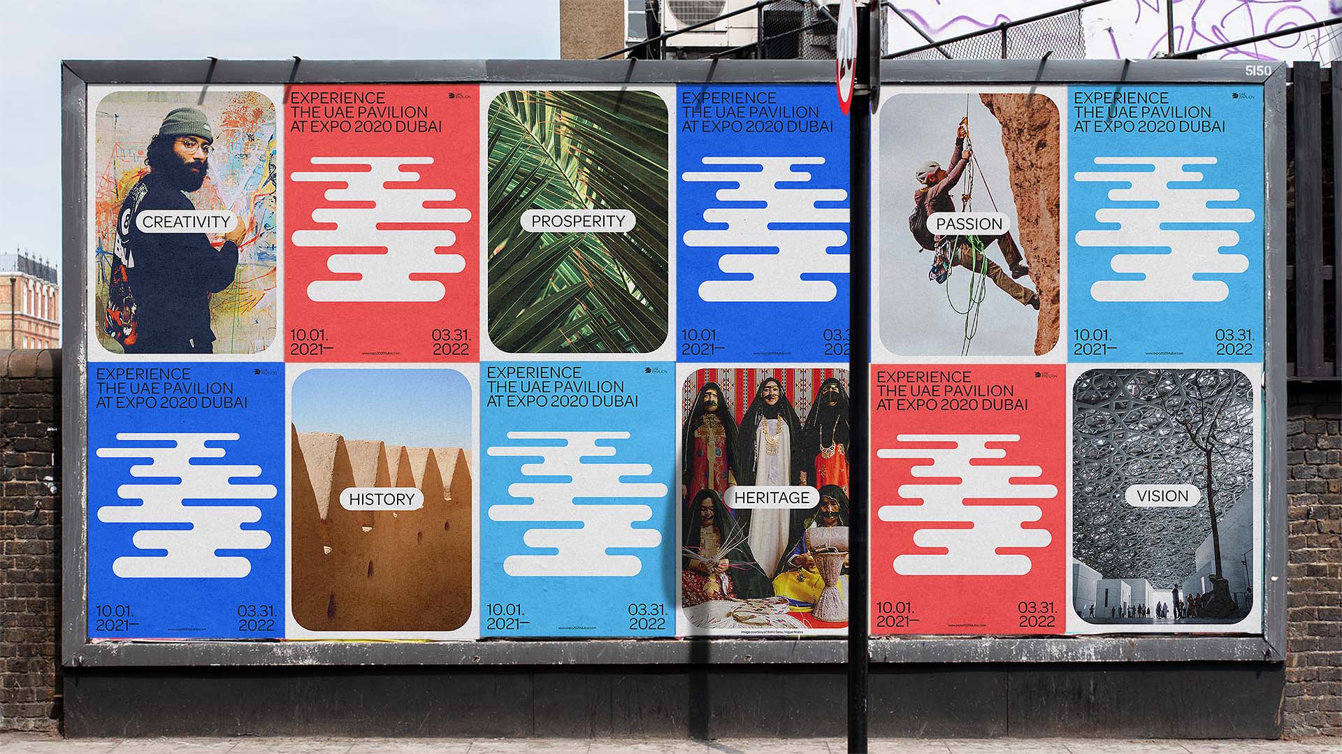


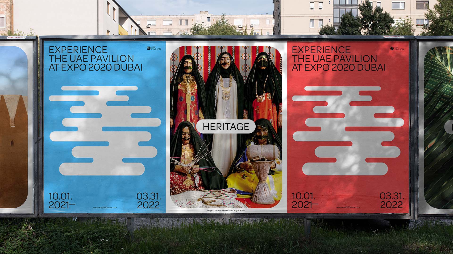
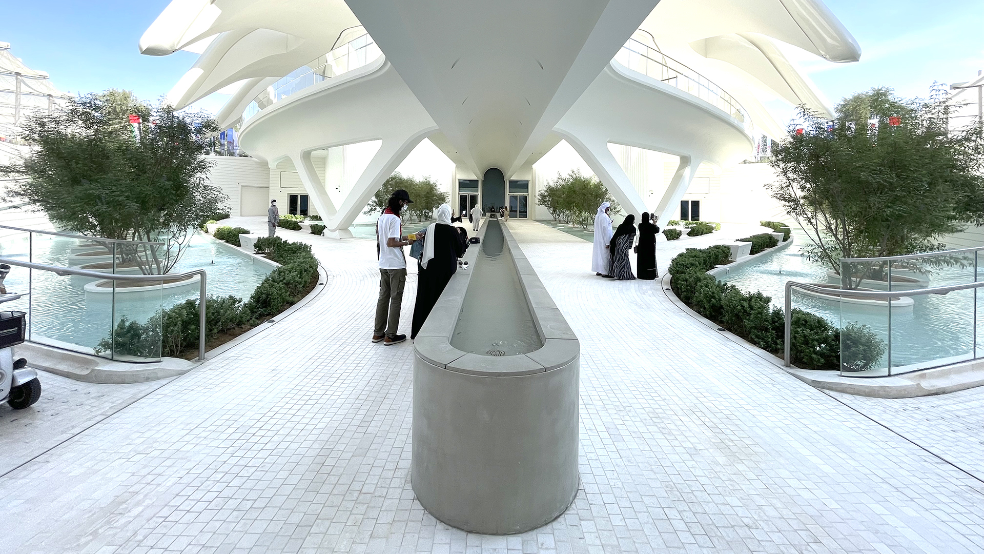


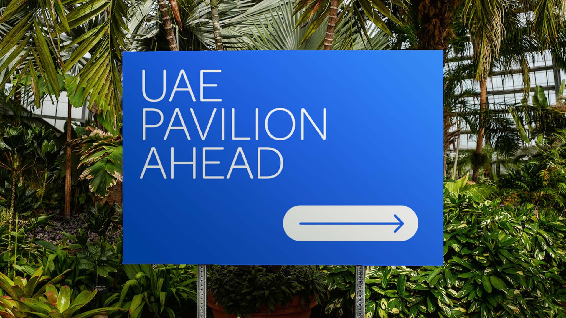


UAE PAVILION IDENTITY
Identity created for the UAE Host Pavilion at Expo 2020 Dubai. The concept is based on the early water canal system, or falaj, that distributed water equally to all people of the UAE, connecting communities and enabling everyone to prosper. Supports Expo 2020's theme: Connecting Minds, Creating the Future. Unrealized concept.
Concept & Design: Whitney Smith
Creative Direction: Philippe Egger, Aki Shelton
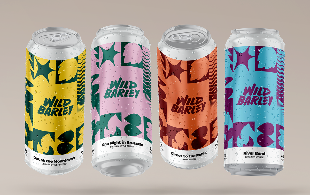

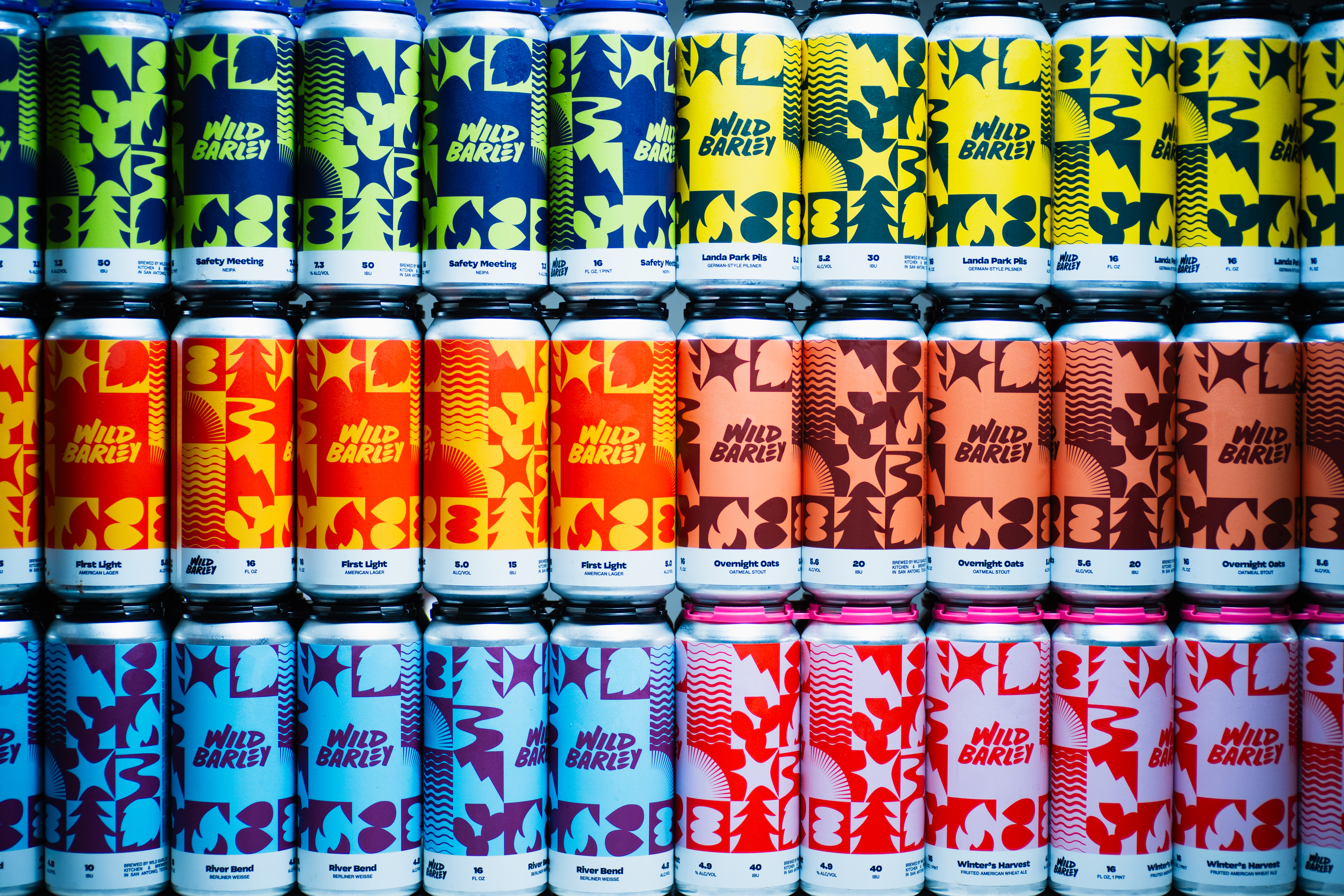
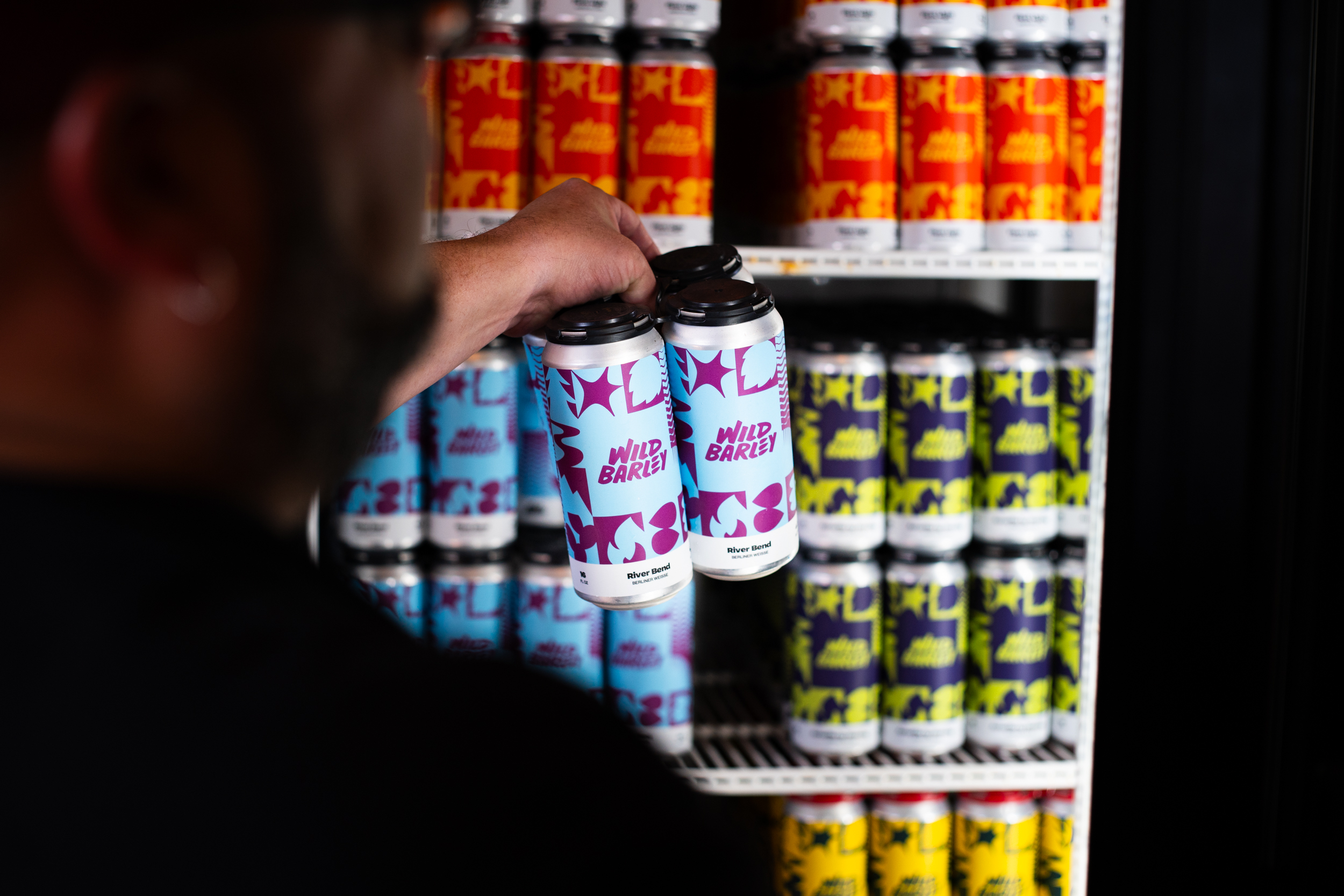
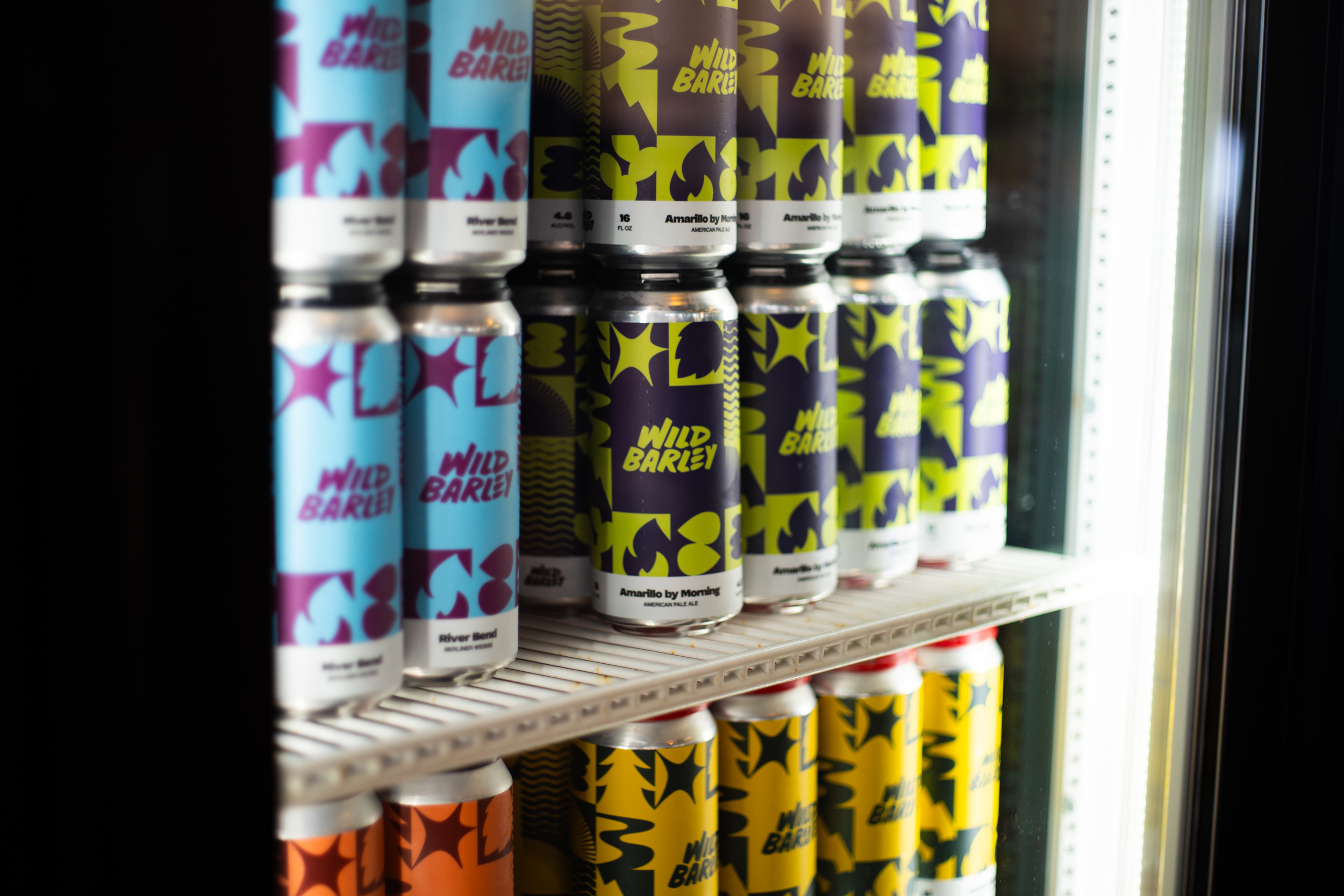
WILD BARLEY BREWING
This San Antonio-based brewery and kitchen hired me to refresh their brand by designing an updated graphic system for their initial launch of canned beers. The system combines references to beer ingredients as well as elements of nature; a passion for the outdoors is a shared foundational value of the founders and the brand.
This San Antonio-based brewery and kitchen hired me to refresh their brand by designing an updated graphic system for their initial launch of canned beers. The system combines references to beer ingredients as well as elements of nature; a passion for the outdoors is a shared foundational value of the founders and the brand.